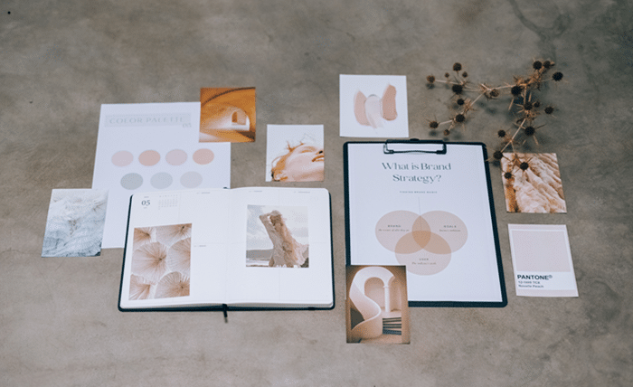
Graphic design has always played an important role in how businesses communicate with their audiences, but its influence has become even more significant in today’s digital world. From social media posts and website banners to product packaging and advertising campaigns, visual design shapes the first impression customers have of a brand. In 2026, businesses face the challenge of creating designs that capture attention while communicating authenticity, professionalism, and personality. With audiences constantly exposed to new content, developing a distinctive visual identity is no longer simply an aesthetic choice. It has become an important part of building recognition and maintaining a competitive presence.
Modern graphic design is influenced by changing consumer preferences, emerging technologies, and the growing demand for meaningful digital experiences. While some brands embrace minimalism and simplicity, others experiment with expressive typography, vibrant colors, and unconventional layouts. The most successful approach depends on understanding your audience and choosing visual elements that support your brand’s message. Rather than following every new trend, businesses should focus on creating designs that feel relevant, memorable, and consistent across different communication channels.
One particularly interesting development is the growing accessibility of creative design tools that allow businesses to experiment without requiring extensive technical experience. Typography, for example, can transform an ordinary message into a distinctive visual element that attracts attention. Marketing teams creating promotional banners, social media announcements, or branded graphics can explore AI text effects to develop imaginative lettering styles that complement their campaigns. Used thoughtfully, these creative treatments can help emphasize important messages, introduce visual personality, and make branded content more engaging without sacrificing readability.
1. Bold Typography That Makes a Statement
Typography is becoming more than a way to display information. It is increasingly used as a central design element that communicates emotion, personality, and brand identity.
Large headlines, expressive lettering, and unconventional font combinations can make even simple designs visually compelling.
For example, a fashion brand might use oversized typography in its seasonal campaign to create a confident, contemporary appearance. A creative agency could experiment with unusual letter spacing or layered text to communicate originality.
However, bold typography should never compromise clarity.
The most effective designs balance visual experimentation with readability. Headlines should remain easy to understand, especially on smaller screens.
Businesses should also maintain consistency by selecting a limited collection of fonts that work well together.
A recognizable typographic style can become an important part of a brand’s identity over time.
2. Minimalist Design With a Strong Purpose
Minimalism continues to influence branding because it allows businesses to communicate messages without unnecessary distractions.
Clean layouts, generous spacing, simple color palettes, and carefully selected visual elements help direct attention toward important information.
For example, a premium skincare company might use neutral backgrounds, elegant product photography, and concise messaging to communicate quality and sophistication.
A technology company could adopt a similar approach to make complicated software features easier to understand.
The challenge is ensuring that simplicity does not become emptiness.
Effective minimalist design still requires thoughtful composition, clear visual hierarchy, and meaningful content.
Every element should contribute to the overall message.
When executed successfully, minimalism can make marketing materials feel organized, professional, and accessible.
3. Vibrant Colors and Unexpected Combinations
While minimalist design remains popular, many brands are also exploring bold color combinations to create distinctive visual experiences.
Bright gradients, contrasting shades, and energetic palettes can help marketing campaigns stand out in crowded digital environments.
A sportswear company might combine electric blue with vibrant orange to communicate movement and excitement.
A creative entertainment brand could experiment with unconventional color combinations to reflect its playful personality.
However, color selection should always support brand positioning.
Using bright colors simply because they attract attention may produce inconsistent results if they conflict with the company’s identity.
Accessibility is another important consideration.
Text and background colors should provide sufficient contrast to remain readable for different audiences.
The goal is to create visual energy without overwhelming viewers.
4. Authentic and Human-Centered Photography
Consumers are increasingly interested in seeing the real people and experiences behind businesses.
This makes authentic photography a valuable part of contemporary graphic design.
Instead of relying entirely on polished stock images, brands can incorporate photographs of employees, customers, workspaces, and everyday activities.
A restaurant might showcase its kitchen team preparing meals.
A clothing brand could feature customers wearing its products in natural environments rather than exclusively using studio photography.
These images can make marketing materials feel more approachable and relatable.
Authenticity does not mean abandoning professional standards.
Good lighting, thoughtful composition, and consistent editing still matter.
The difference is that photographs should reflect genuine experiences rather than create unrealistic expectations.
Human-centered visuals can help strengthen emotional connections and communicate a brand’s personality.
5. Three-Dimensional Elements and Depth
Three-dimensional design offers new opportunities to create visually engaging digital experiences.
Layered graphics, realistic shadows, dimensional typography, and carefully rendered objects can introduce depth into otherwise flat compositions.
For example, an electronics retailer might use three-dimensional product illustrations to highlight features in promotional campaigns.
A software company could incorporate dimensional icons into its website to make digital interfaces more visually interesting.
These techniques can create a sense of movement and realism.
However, excessive visual complexity may distract audiences from the main message.
Three-dimensional elements work best when they serve a clear communication purpose.
Designers should also consider performance when using detailed graphics on websites.
Large visual assets can affect loading speed, particularly on mobile devices.
Balancing creativity with technical efficiency helps maintain a positive user experience.
6. Retro-Inspired Design With Modern Details
Nostalgia continues to influence creative industries, and graphic design is no exception.
Retro-inspired typography, vintage color palettes, grainy textures, and familiar visual patterns can create emotional connections with audiences.
However, contemporary retro design often combines nostalgic references with modern layouts and digital techniques.
A coffee brand might use vintage-inspired packaging while maintaining clean, readable product information.
A music-related business could incorporate design elements inspired by earlier decades into contemporary social media graphics.
The effectiveness of nostalgic design depends on audience relevance.
Different generations associate particular visual styles with different experiences.
Brands should research their target customers before selecting retro influences.
Rather than copying historical designs directly, businesses can reinterpret familiar aesthetics in ways that feel fresh and distinctive.
7. Custom Illustrations That Express Brand Personality
Custom illustrations allow businesses to communicate ideas through a recognizable artistic style.
Unlike generic visual assets, original illustrations can be developed specifically around a brand’s identity, values, and communication goals.
A financial technology company might use friendly illustrations to explain complex banking concepts.
An educational platform could develop illustrated characters that guide learners through different activities.
These visual elements can make complicated information more approachable.
Illustrations are particularly useful for websites, onboarding materials, presentations, and educational content.
Consistency is essential.
Using a shared color palette, line style, and character design helps ensure that illustrations feel like part of the same visual system.
When developed strategically, custom artwork can become a distinctive branding asset.
8. Motion Graphics and Animated Visuals
Static images remain valuable, but motion graphics offer additional ways to capture attention and communicate information.
Animated typography, subtle transitions, moving illustrations, and short visual demonstrations can make digital content more engaging.
For example, an online retailer might animate product features to explain how an item works.
A marketing agency could use simple motion graphics to present campaign results or demonstrate a process.
Animation is especially useful when movement helps viewers understand information more quickly.
However, unnecessary motion can create distractions and accessibility challenges.
Businesses should avoid excessive flashing effects and provide appropriate alternatives for users who prefer reduced motion.
The most effective animation supports the message rather than competing with it.
Thoughtful movement can improve storytelling while maintaining a polished visual experience.
9. Sustainable and Nature-Inspired Visual Design
Environmental awareness continues to influence how businesses present themselves.
Nature-inspired design often incorporates earthy colors, organic shapes, botanical illustrations, and textures that reference natural materials.
These elements can communicate calmness, simplicity, and a connection to the environment.
A sustainable packaging company might use natural tones and minimal illustrations to reinforce its positioning.
A wellness brand could incorporate soft green shades and organic patterns into its website design.
However, businesses should distinguish between visual aesthetics and actual environmental responsibility.
Using green colors or nature-inspired graphics does not automatically make a product sustainable.
Environmental claims should be accurate and supported by genuine business practices.
When design reflects authentic values, it can strengthen credibility and communicate a consistent brand message.
10. Personalized and Adaptable Brand Visuals
Modern brands communicate across websites, social media platforms, email campaigns, digital advertisements, and physical materials.
A single rigid design format is rarely suitable for every environment.
Adaptable visual identities allow businesses to maintain recognizable branding while adjusting layouts, imagery, and messaging for different audiences and platforms.
For example, a company might use detailed graphics for desktop presentations and simplified versions for mobile advertisements.
An online retailer could adapt promotional visuals to highlight different product categories while maintaining consistent typography and colors.
Personalization can also improve relevance.
Marketing teams may create different visual versions of a campaign for distinct customer segments based on their interests or purchasing needs.
However, personalization should respect privacy and avoid using sensitive information in ways customers would not reasonably expect.
A flexible visual system helps businesses remain consistent without making every marketing asset look identical.
How to Choose the Right Graphic Design Trends for Your Business
With so many creative directions available, deciding which trends to adopt can feel overwhelming.
The first step is understanding your brand’s identity.
Consider the emotions, values, and characteristics you want customers to associate with your business.
A professional consulting firm may benefit from clean typography and restrained color choices, while a youth-focused entertainment company might embrace expressive visuals and energetic layouts.
Next, research your audience.
Review the design styles that resonate with your customers and identify opportunities to differentiate your brand from competitors.
Experiment with selected trends through smaller campaigns before making significant changes to your overall identity.
For example, test a new typographic treatment in a social media campaign or introduce subtle motion graphics into an existing advertisement.
Monitor audience responses and relevant performance indicators.
Engagement rates, click-through rates, conversions, and qualitative customer feedback can help determine whether design changes are effective.
Most importantly, avoid adopting trends solely because they are fashionable.
A strong visual identity should remain recognizable even as individual design techniques evolve.
The Importance of Consistency Across Digital Platforms
A recognizable brand experience depends on consistent visual communication.
Customers may discover a business through Instagram, visit its website, subscribe to its newsletter, and later encounter its advertisements.
Each interaction should feel connected to the same brand.
Creating practical brand guidelines can help achieve this consistency.
These guidelines should define preferred fonts, color palettes, logo usage, photography styles, and general layout principles.
Businesses can also develop reusable templates for frequently published content.
Templates reduce repetitive design work while allowing teams to maintain quality.
However, consistency should not prevent experimentation.
Brands can introduce fresh creative elements while preserving the characteristics that make them recognizable.
The objective is to establish a flexible visual identity that supports both familiarity and innovation.
Conclusion
Graphic design in 2026 offers businesses exciting opportunities to express their personalities, communicate ideas, and create memorable customer experiences. From bold typography and vibrant colors to authentic photography, motion graphics, and adaptable branding systems, contemporary design approaches can help companies strengthen their visual presence.
Yet successful design is not determined by how many trends a business adopts. It depends on selecting creative elements that support clear communication, reflect genuine brand values, and resonate with the intended audience.
By combining thoughtful design choices with consistency, accessibility, and strategic experimentation, businesses can develop visual identities that remain distinctive, engaging, and effective in a constantly changing digital landscape.